PRESS ARCHIVE
GraphicDesign& Mathematics, Golden Meaning, Fifty-five graphic experiments by graphic designers, typographers and image-makers, edited by Lucienne Roberts, Rebecca Wright with Alex Bellos, pp.88–91, London, UK, February 2014 (English)
___
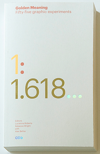
CLICK TO SEE COVER

GRAPHICDESIGN& MATHS | GOLDEN MEANING
Lucienne Roberts and Rebecca Wright of pioneering publishing house GraphicDesign& kindly invited FL@33 to contribute to the second publication in their 'Graphic Design and ...' series – namely GD&'s Mathematics – Golden Meaning.
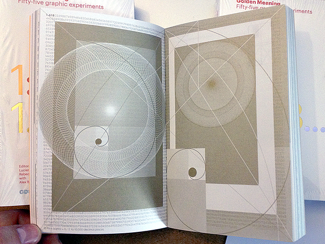
___ Shown here is the published double-page spread of the final (golden) artwork but also a screenshot of unpublished colour variations.
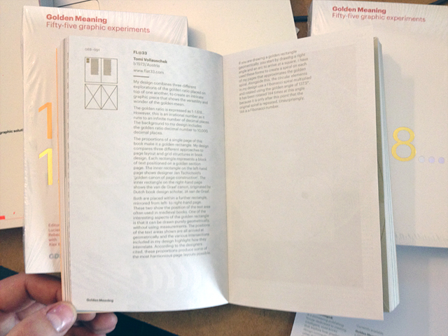
___ Published rationale, Tomi Vollauschek, FL@33: My design combines three different explorations of the golden ratio placed on top of one another, to create an intricate graphic piece that shows the versatility and wonder of the golden mean.
___ The golden ratio is expressed as 1 : 1.618… However, this is an irrational number as it runs to an infinite number of decimal places. The background to my design includes the golden ratio decimal number to 10,000 decimal places.
___ The proportions of a single page of this book make it a golden rectangle. My design compares three different approaches to page layout and grid structures in book design. Each rectangle represents a block of text positioned on a golden section page. The inner rectangle on the left-hand page shows designer Jan Tschichold’s ‘golden canon of page construction’. The inner rectangle on the right-hand page shows the van de Graaf canon, originated by Dutch book design scholar, JA van de Graaf. Both are placed within a further rectangle, mirrored from left- to right-hand page. These two show the position of the text area often used in medieval books. One of the interesting aspects of the golden rectangle is that it can be drawn purely geometrically, without using measurements. The positions of the text areas shown are all arrived at geometrically and the various intersections included in my design highlight how they interrelate. According to the designers cited, these proportions produce some of the most harmonious page layouts possible.
___ If you are drawing a golden rectangle geometrically, you start by drawing a right angle and an arc to arrive at a square. I have used these forms to create a spiral on each of my pages that approximates the golden spiral. Alongside this, the circular elements in my design use a Fibonacci spiral multiplied and rotated using the golden angle of 137.5°. It has been rotated 144 times at this angle because it is only after this point that the original spiral is repeated. Unsurprisingly, 144 is a Fibonacci number.
CLICK FOR MORE INFO | OFFICIAL BLURB
Often referred to as the ‘divine proportion’, the golden mean has long served as a blueprint for innovation and aesthetic appeal. Golden Meaning puts this to the test, exploring the relationship between graphic design and mathematics to present the golden mean as never before.
___ Intended to be as intriguing as it is illuminating, Golden Meaning collects the responses of 55 (think Fibonacci) designers, typographers and image-makers to the same brief – to communicate, explore or explain the golden mean, first defined by Euclid. New works by Hort, Moniker, Catherine Zask, Kapitza, Ian Wright, Bibliothèque, Alan Kitching, MGMT. design, Julia, Mike Perry Studio, The Luxury of Protest, FL@33 and George Hardie tackle this ancient mathematical quandary with intelligence, style and a generous pinch of wit – employing sculpture, poetry, cosmology and even cuisine. Each design is accompanied by a short rationale explaining the designer’s decision-making process.
___ An attempt to demystify mathematics, Golden Meaning is not just a book for graphic designers. Whatever your interest or level of knowledge these 55 interpretations will inform and delight. A contemporary take on a golden oldie, Golden Meaning challenges perceptions of what – and who – graphic design is for.
___ As Mathematician, broadcaster, writer and Golden Meaning advisor Alex Bellos observes in his introductory essay: ‘This book deserves attention from the maths community as much as it does the design one’. Bellos’s Alex’s Adventures in Numberland was a 2010 Sunday Times bestseller and New Scientist Book of the Year. His latest title, Alex Through the Looking-Glass, publishes in 2014.
___ Golden Meaning itself shines, with pages printed in one colour – a gold special – and cover run in luminescent fluorescent yellow and incorporating gold and holographic silver metallic foils.
SPECS
Standard format paperback
288 pages
110 x 178mm
Perfect bound
Cover in two specials and two foils
Text pages in gold special throughout
£17.50 + p&p (£15 + p&p introductory price)
Published February 2014
Categories: FL@33 projects, Illustration, Print, Typography
Sectors: Culture | Arts, Publishing, Retail


