≶ | S.A.V. MONOGRAM | LOGO
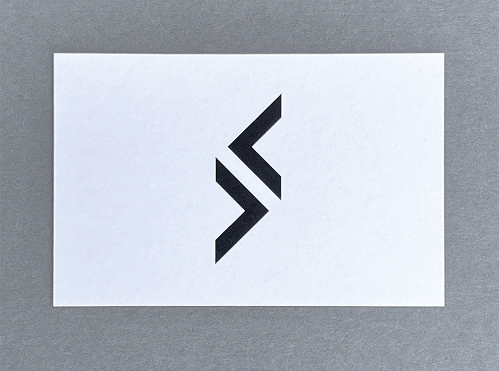
The personal S.A.V. monogram, designed by FL@33's Tomi Vollauschek, is a striking blend of minimalism and symbolism for a young man with a bright future ahead of him.
___ The more abstract letters 'A' and 'V' turned on their sides as two opposing arrows converge together to form the main letter 'S', capturing the essence of duality and balance. These arrows symbolize the past and future, while the 'S' represents the present moment, illustrating how one can be grounded in the now while learning from history and looking forward.
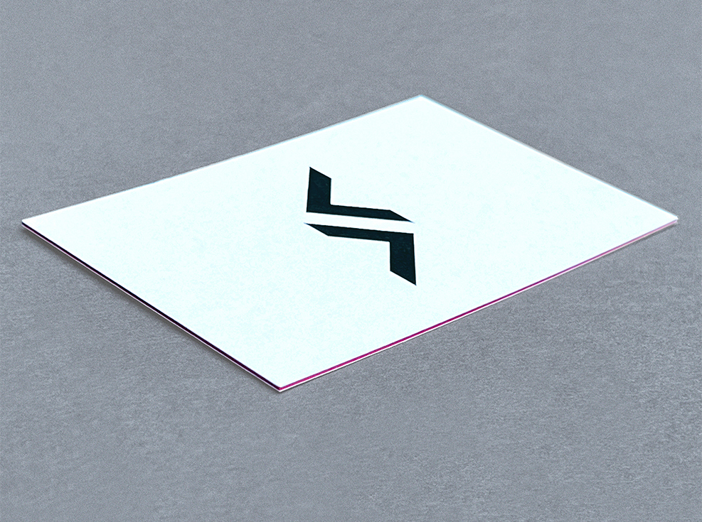
___ This distinctive logo is printed on luxurious 600gsm card made from four layers of uncoated, naturally textured paper. The two middle layers are a vibrant orange, sandwiched between two white outer layers, creating a striking contrast with an elegant orange seam along the edges.
___ The back of the card features contact details and a website link in a sophisticated sans serif typeface, aligning with the subtle identity.
___ As a result, this design embodies personal growth, integrating diverse experiences and navigating life's complexities. The fusion of the arrows into the 'S' highlights the thoughtful interplay between reflection and action, emphasizing how experiences shape the present.
<
Where paths diverge,
a new journey begins,
In the space between,
true wisdom spins.
≶
Forward and back,
the arrows may roam,
In their dance,
the present finds its home.
>
Categories: FL@33 projects, Logos | Identities, Print, Typography
Sectors: Non Profit, Others


