PRESS ARCHIVE
Computer Arts Project, 91, December issue, attached digital artist showcase, vol. 1, New Masters of Digital Art, 4-page FL@33 profile / interview, featuring various works, pp.16–19, London, UK, December 2006 (English)
___
PHOTOSHOP MASTER | FL@33
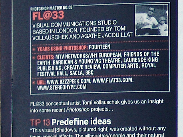
FL@33 | Visual communications studio based in London, founded by Tomi Vollauschek and Agathe Jacquillat | Years ussing Photoshop: Fourteen. | Clients: MTV Networks / VH1 European, Friends of the Earth, Barbican & Young Vic Theatre, Laurence King Publishing, Creative Review, Computer Arts, Royal Festival Hall, Sacla, BBC. | Url: bzzzpeek.com, flat33.com, stereohype.com
FL@33 conceptual artist Tomi Vollauschek gives us an insight into some recent Photoshop projects...
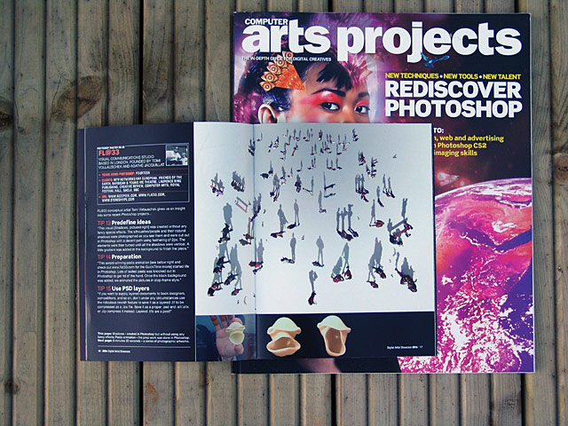
| TIP 13 | Predefine ideas | "This visual (Shadows, pictured right) was created without any fancy special effects. The silhouettes / people and their natural shadows were photographed as you see them and were cut out in Photoshop with a decent path using feathering of 2px. The elements were then turned until all the shadows were vertical. A little gradient was added in the background to finish the piece."
| TIP 14 | Preparation | "This award-winning pasta animation (see below right and check out flat33.com for the QuickTime movie) started life in Photoshop. Lots of boiled pasta was knocked out in Photoshop to get rid of the hand. Once the black background was added, we animated the pictures in stop-frame style."
| TIP 15 | Use PSD layers | "If you want to supply layered documents to book designers, competitions, and so on, don't under any circumstances use the ridiculous newish feature to save it as a layered .tif to be able to LZW-compress the file. Save it as a proper .psd and .sit/.sitx or .zip compress it instead. layoured .tifs are a pest!"
CAPTION
This page: Shadows – created in Photoshop but without and fancy effects; Pasta animation – the prep work was done in Photoshop.
Next page: 8 minutes 20 seconds – a series of photographic artworks.
CLICK FOR MORE INFO | UNEDITED INTERVIEW
| Name: Tomi Vollauschek, FL@33 and stereohype.com | Clients: MTV Networks / VH1 European, Friends of the Earth, Barbican & Young Vic theatre, Laurence King Publishing, Creative Review, Computer Arts, Royal Festival Hall, Sacla, BBC, Matelsom, Alsop Architects / Valencia Biennale 2003, GraficEurope conference 2004 / RotoVision, Pyramyd Editions, The Creator Studio / Torraspapel, Ecole Normale de Musique de Paris, BlackBook magazine and Groupe Galeries Lafayette, besides others. | Years using Photoshop: 14 – as far as i can remember is started with Photoshop 2.5 which came on 7 or floppy disks. | Websites: bzzzpeek.com, flat33.com, stereohype.com |
___ Project description: Shadows. This visual was created without any fancy special effects. The silhouettes / people and their natural shadows were photographed as you see them and were simply cut out in Photoshop with a decent path using feather 2px. The elements were then simply turned until all the shadows were vertical. A little gradient in the background was added to finish the artwork. |TIP| The only real 'tip' we could think of for this visual is that the idea and concept were pre-defined before we worked in photoshop which was then only used as a basic tool to get the job done. Oh – and the gradient layer does of course need to have a bit of 'noise' added to it before it goes to print.
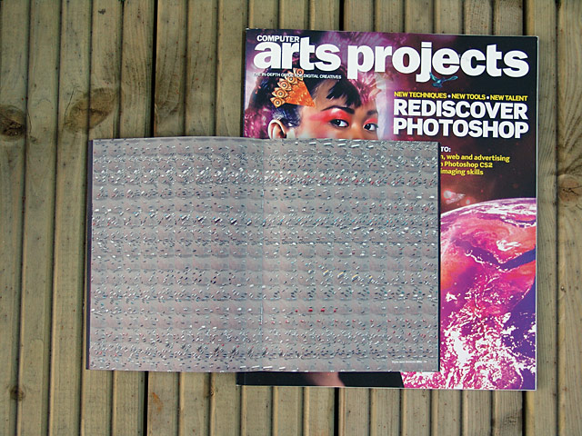
___ Project description: 8 minutes 20 seconds is a series of photographic artworks. Five sequences were created. The series is an excerpt from the FL@33 monograph published as part of the bi-lingual design & designer series by french Pyramyd Editions. 8 min 20 sec was also exhibited at the FL@33 / Stereohype exhibition in Paris from December 2004 – January 2005 at the Zoto Prod space. The concept is based on capturing the city (in this case Paris) in video sequences of 8 minutes and 20 seconds (= 500 seconds). Each sequence was then reduced to 1 frame per second. The resulting prints are based on the individual collections of 500 frames (each) and are positioned within square compositions (available in two sizes: 40 x 40cm or 90 x 90cm). |TIP| Another example of Photoshop being used for relatively basic tasks to create intriguing imagery. The main work was once again concept, idea and actually getting the initial footage (in this case video stills). Photoshop was then used to compile the 500 stills per image using the 'automate / contact sheet' option.
___ Project description: Singing Pasta or Eat and be Eaten | This award-winning animation (check flat33.com for quicktime movie) started life in photoshop were lots and lots of boiled pasta were knocked out in photoshop to get rid of the background (the hand holding the pasta). Once the black background was added we animated the pictures in stop-frame style using director (that was long before we learned how to use after effects). |TIP| The main work was again concept, idea and actually getting the initial footage. Yet another example of Photoshop being used for basic tasks to create intriguing imagery.
___ |TIP| And a general Photoshop tip: if you want to supply layered/not flattened documents to book designers, competitions, etc: please no not under any circumstances use the ridiculous newish feature to save it as a layered tif to be able to lzw compress it. save it as a proper psd and .sit/.sitx or .zip compress it instead. layered tifs are a pest!!!
