PRESS ARCHIVE
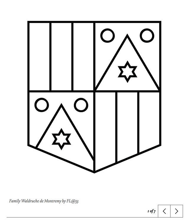
Creative Review, Creative Inspiration, Exploring the enduring influence of heraldry in design, by Aimée McLaughlin, about Modern Heraldry: Volume Two by Counter-Print, featuring various FL@33-designed creations including the Waldruche de Montremy family shield redesign as mentioned in CR, London, UK, 1 May 2020 (English)
___
Archive copy of: creativereview.co.uk/...

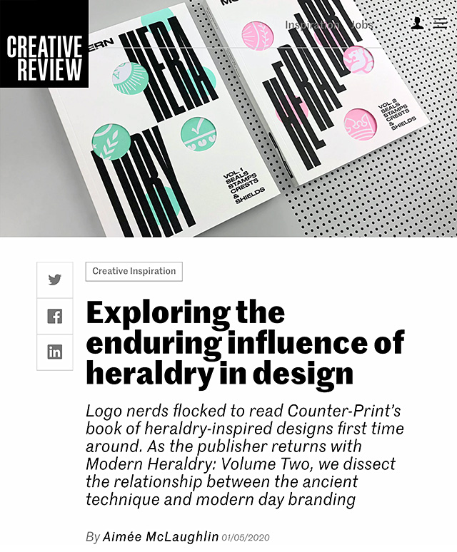
Modern Heraldry: Volume Two | Logo nerds flocked to read Counter-Print’s book of heraldry-inspired designs first time around. As the publisher returns with Modern Heraldry: Volume Two, we dissect the relationship between the ancient technique and modern day branding.
___ First developed in the 12th century, heraldry was a practice originally reserved for medieval knights, and served a simple but practical purpose: to show who you were. At the time, ... (...)
CLICK TO READ ARTICLE WITH INTERVIEW
(...) Continued:
... a banner had to be simple enough for someone to read while on a galloping horse, for the outcome of misreading such symbology could (and often did) cost lives on the battlefield.
___ As a means of illustrating a knight’s achievements, the coat of arms quickly evolved into a status symbol that provided an insight into everything from family history and property to profession and occupation. Different crest designs also developed symbolic meanings: flowers had connotations around hope and joy, fruit signified bounty and peace and, depending on which animal you chose, you could emphasise character traits such as wisdom and loyalty.
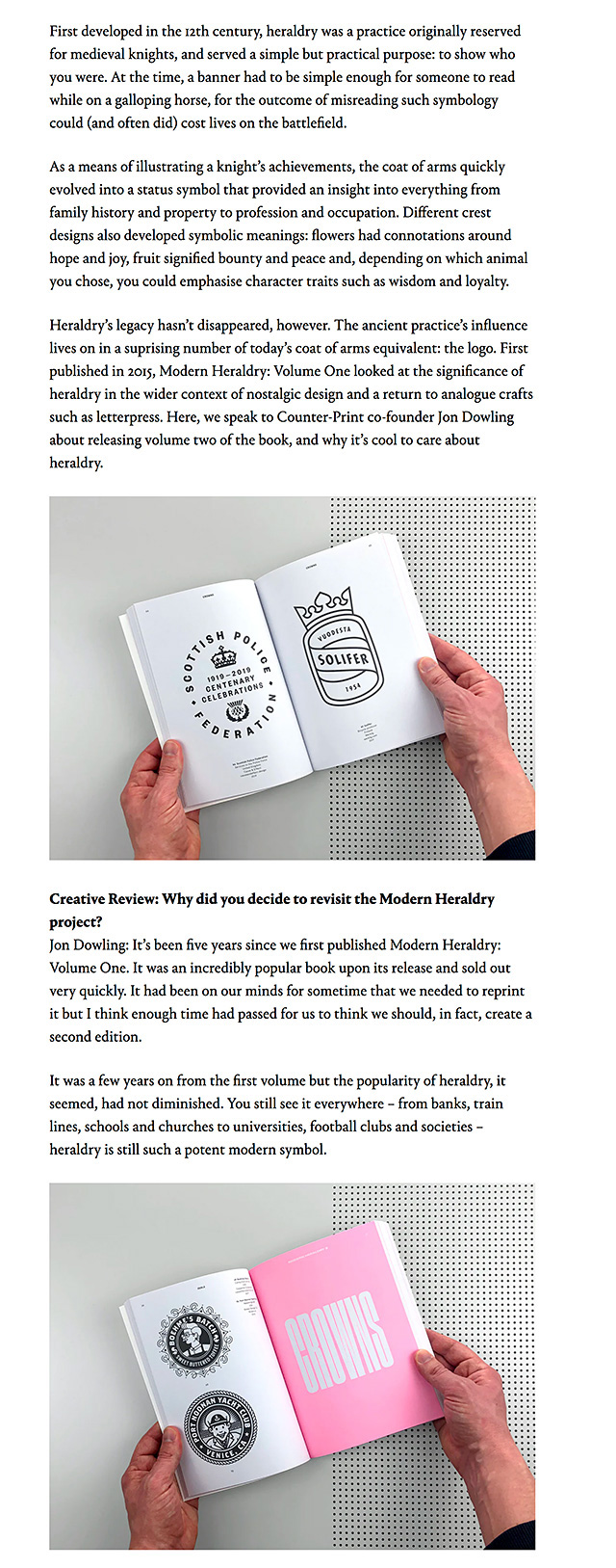
___ Heraldry’s legacy hasn’t disappeared, however. The ancient practice’s influence lives on in a surprising number of today’s coat of arms equivalent: the logo. First published in 2015, Modern Heraldry: Volume One looked at the significance of heraldry in the wider context of nostalgic design and a return to analogue crafts such as letterpress. Here, we speak to Counter-Print co-founder Jon Dowling about releasing volume two of the book, and why it’s cool to care about heraldry.
Creative Review: Why did you decide to revisit the Modern Heraldry project?
Jon Dowling: It’s been five years since we first published Modern Heraldry: Volume One. It was an incredibly popular book upon its release and sold out very quickly. It had been on our minds for sometime that we needed to reprint it but I think enough time had passed for us to think we should, in fact, create a second edition.
___ It was a few years on from the first volume but the popularity of heraldry, it seemed, had not diminished. You still see it everywhere – from banks, train lines, schools and churches to universities, football clubs and societies – heraldry is still such a potent modern symbol.
CR: What sort of designs are included in part two?
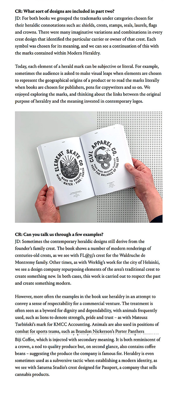
JD: For both books we grouped the trademarks under categories chosen for their heraldic connotations such as: shields, crests, stamps, seals, laurels, flags and crowns. There were many imaginative variations and combinations in every crest design that identified the particular carrier or owner of that crest. Each symbol was chosen for its meaning, and we can see a continuation of this with the marks contained within Modern Heraldry.
___ Today, each element of a herald mark can be subjective or literal. For example, sometimes the audience is asked to make visual leaps when elements are chosen to represent the geographical origins of a product or to read the marks literally when books are chosen for publishers, pens for copywriters and so on. We enjoyed exploring the marks, and thinking about the links between the original purpose of heraldry and the meaning invested in contemporary logos.
(...) Creative Review: Can you talk us through a few examples?
Jon Dowling: Sometimes the contemporary heraldic designs still derive from the founder’s family crest. The book shows a number of modern renderings of centuries-old crests, as we see with FL@33’s crest for the Waldruche de Montremy family. Other times, as with Werklig’s work for the city of Helsinki, we see a design company repurposing elements of the area’s traditional crest to create something new. In both cases, this work is carried out to respect the past and create something modern. (...)

CLICK TO CONTINUE READING
(...) Continued:
However, more often the examples in the book use heraldry in an attempt to convey a sense of respectability for a commercial venture. The treatment is often seen as a byword for dignity and dependability, with animals frequently used, such as lions to denote strength, pride and trust – as with Mateusz Turbiński’s mark for KMCC Accounting. Animals are also used in positions of combat for sports teams, such as Brandon Nickerson’s Porter Panthers volleyball mark. Wolves seem to be chosen for connotations of team work (as seen in Communal’s Cluster & Bosk logo for a film production company), owls for wisdom, foxes for cunning, while others represent traits such as wisdom, resourcefulness and loyalty.
___ Crowns are often used to convey quality. This can be seen with Apus’ mark for Biji Coffee, which is injected with secondary meaning. It is both reminiscent of a crown, a nod to quality produce but, on second glance, also contains coffee beans – suggesting the produce the company is famous for. Heraldry is even sometimes used as a subversive tactic when establishing a modern identity, as we see with Saturna Studio’s crest designed for Passport, a company that sells cannabis products.
CR: Why do you think heraldry still has such a big presence in design and branding today?
JD: Audiences perhaps respond well to nostalgia, with many designers keen to capture the visual romance and history of a brand, or convey craftsmanship. Despite our modern obsession with technology, there has been a leaning towards craftsmanship and quality in what we choose to consume, in opposition to mass production and globalisation, and the style of the logos collected in this book reflect this trend.
___ This could be termed as a kind of ‘neo-nostalgia’, which many brands and designers turn to, creating modern marks that share historic, often heraldic, visual cues in order to convey a sense of respectability, dignity and dependability. This traditional aesthetic arguably resonates so strongly among brands and designers because it reflects the history behind brand-making. This can be seen both stylistically – before computers it was all handmade – and in its construction, with the laurel, shield, seal and crest chosen to display information.
CR: What do you think today’s creatives can learn from the design principles of heraldry?
JD: Today’s designers are, thanks to the web, lucky enough to be equipped with an encyclopaedic grasp of design history, and are able to use historical reference as inspiration. They are designing marks that intentionally counteract the highly-polished, digital-based logos associated with mass consumerism; turning instead to craft-based mediums such as hand-lettering, stamps, traditional symbolism and historic embellishment.
___ The combination of the old and the new, craftsmanship and technology, often creates a fertile breeding ground for innovative logo solutions and marks that are invested with layered meaning, as well as beautiful aesthetics. As ever, there is a much inspiration to be gained from looking to the past, exploring heraldry and the links we make between symbology and meaning.
Modern Heraldry: Volume Two is available to buy from counter-print.co.uk


CLICK TO SEE MORE


