PRESS ARCHIVE
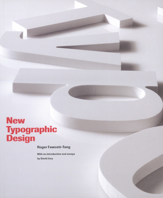
New Typographic Design, Laurence King Publishing, by Roger Fawcett-Tang, featuring seven FL@33 projects, categories: Type as Image and Type in Motion (SCSI lettering, Dalai Lama Speech poster, Ascii Eye Animation, FL@33 Street Type Logo, Creative Review cover, AAT – Animated, Acoustic Typefaces, Display Type experiment), p.71, p.91, p.100, p.103, pp.166–167, London, UK, May 2007 (English)
___
NEW TYPOGRAPHIC DESIGN
The book features seven FL@33 projects in the categories Type as Image and Type in Motion – SCSI lettering, Dalai Lama Speech poster, Ascii Eye Animation, FL@33 Street Type Logo, Creative Review cover, AAT – Animated, Acoustic Typefaces and Display Type experiment, a previously unreleased typographic experiment. Display Type was created in 2004 and fine-tuned in late 2006 especially for the book.
CAPTIONS
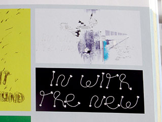
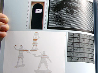
|p.71| Design: FL@33 | Project: SCSI font | Category: Magazine layouts | Date: 2004 | Illustration and 'SCSI' typeface design for Creative Review feature on Rick Poynor's Communicate: Independent Britsh Graphic Design since the Sixties. The letter shapes are formed from now-obsolete SCSI computer connection cables. The lettering has a handwritten quality which is at odds with the digital source material. |p.91| Design: FL@33 | Project: Dalai Lama Speech | Category: Poster | Date: 2003 | For an exhibition called Public Address System 40 designers were asked to create a poster interpreting a public speech of their choice, ranging from great political addresses to song lyrics. The exhibition was organised by Henry Peacock Gallery and Grafik magazine. This one interprets a speech by the Dalai Lama to the European Parliament in October 2001. The text is broken into three sections sculpted into the shape of three warring figures wielding rocks, swords and guns. Key sentences are highlighted in fluorescent orange. |p.100| Design: FL@33 | Project: ASCII Animation | Category: Animation | Date: 2003 | The designers were commissioned by Alsop Architects in London to design an installation for an exhibition called A&M (Department Stores of Proper Behaviour) at the Valencia Biennale. The project was organised by Will Alsop and Bruce McLean. The designers' installation was called Reading Department and featured ASCII-based animated sequences of a close-up of an eye which appears to be reading lines of imagined text. The...
(...) CONTINUE READING
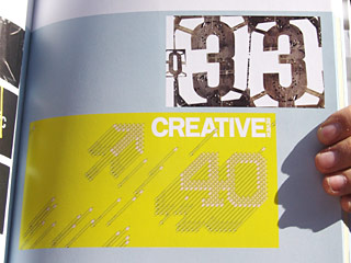
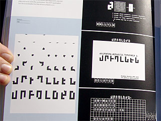
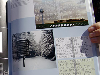
...sequences were shown on television screens built into confessional boxes. |p.103, top| Design: FL@33 | Project: Street font | Category: Illustration | Date: 2004 | This piece proves that, with a bit of digital manipulation, typographic forms can be found anywhere and everywhere. After comping together variousaerial photographs of road junctions and roundabouts, the designers removed all other elements – buildings, footpaths etc –from the shots. The result is a quirky font with varied line widths and radii. |pp.103, bottom| Design: FL@33 | Project: Pencil Sculpture Illustration Series | Category: Magazine cover | Date: 2002 | Commissioned by Creative Review, the brief for this piece was to illustrate '40 Years of D&AD'. The designers created an illustration from a stack of yellow pencils, a symbol closely associated with the D&AD, laid at a 45-degree angle. The '40' is given a dynamic drop shadow by the pencil ends. |pp.166| Design: FL@33 | Project: AAT – Animated, Acoustic Typefaces | Category: Font | Date: 1999–2001 | A font collection that explores different typographic qualities and possibilities when used in print and on screen. The interactive application was finished in early January 2001 for the Royal College of Art 'Work in Progress' exhibition. There are three typefaces: Delayed, Unfolded and Binary. Each is available in different sound and animation modes. By using mouse and keyboard, you can play and write with the application. The AAT application can be downloaded for free at flat33.com. |pp.167| Design: FL@33 | Project: Display (Self-initiated) | Category: Typeface | Date: 2004 | This font is based on a mechanical typeface found on signage and information displays all over Paris. The designers have produced animated sequences to show how it could be used in different environments.
SELECTED STOCKISTS
amazon.co.uk
amazon.com
amazon.de
amazon.fr
amazon.ca
amazon.co.jp
SPECS
Paperback
192 pages
284 x 236mm
ISBN: 978-1856694681
£25
Published May 2007
Laurence King Publishing
OFFICIAL BLURB
A visual guide to the best in contemporary typographic design, featuring examples and usages of modern typography from around the world. Covering a wide variety of applications, from design to print – magazines, books, brochures, posters, etc – to signage systems and screenbased typography, the book gives an insight into the current trends and directions of modern typography and provides a rich source of inspiration for design students and established designers alike.
