\/\/\/\ LOGO DESIGN | FIRST CUVÉE | CHAMPAGNE WALDRUCHE DE MONTREMY
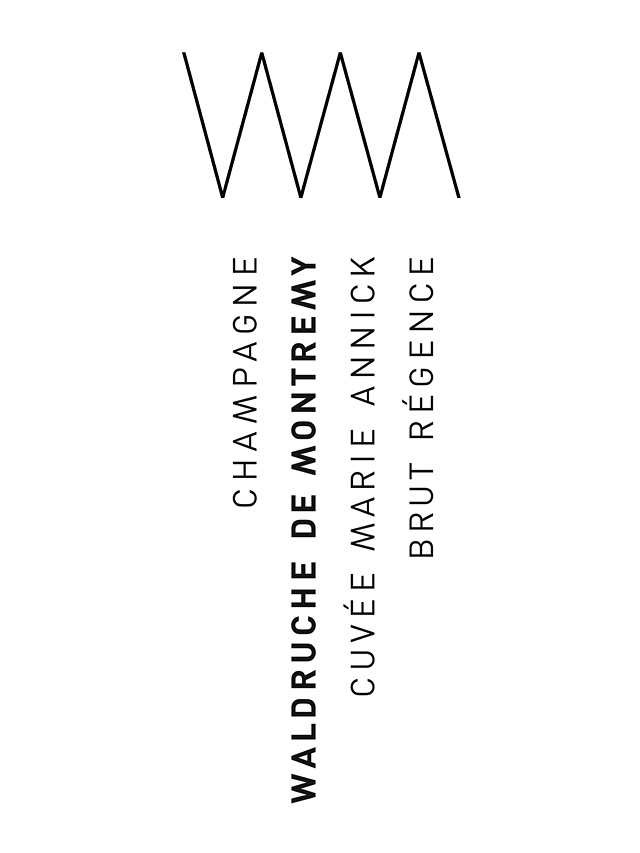
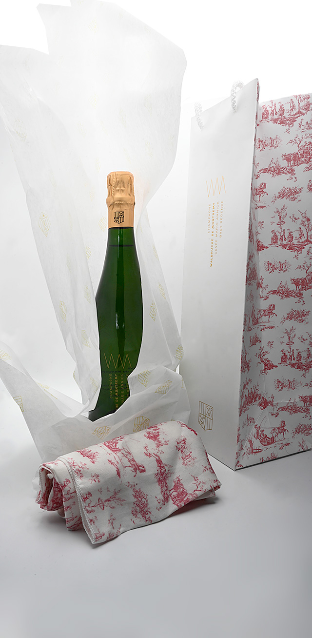
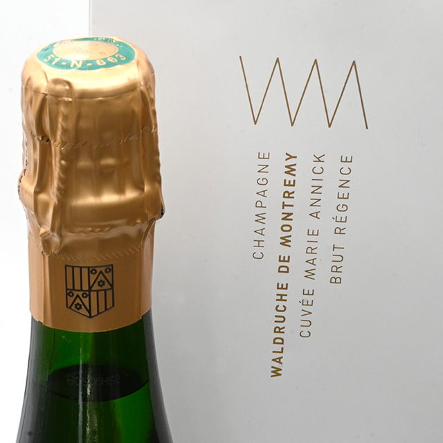
FL@33 was commissioned by members of the French family Waldruche De Montremy to develop a minimal, modern identity for a new champagne brand, including a family shield redesign, a champagne brand identity with packaging solutions and a \/\/\/\ champagne logo system.
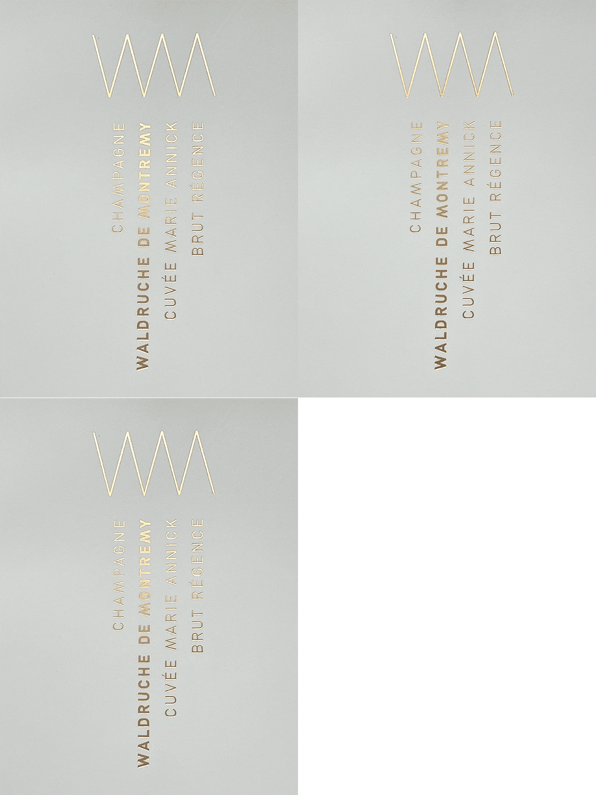
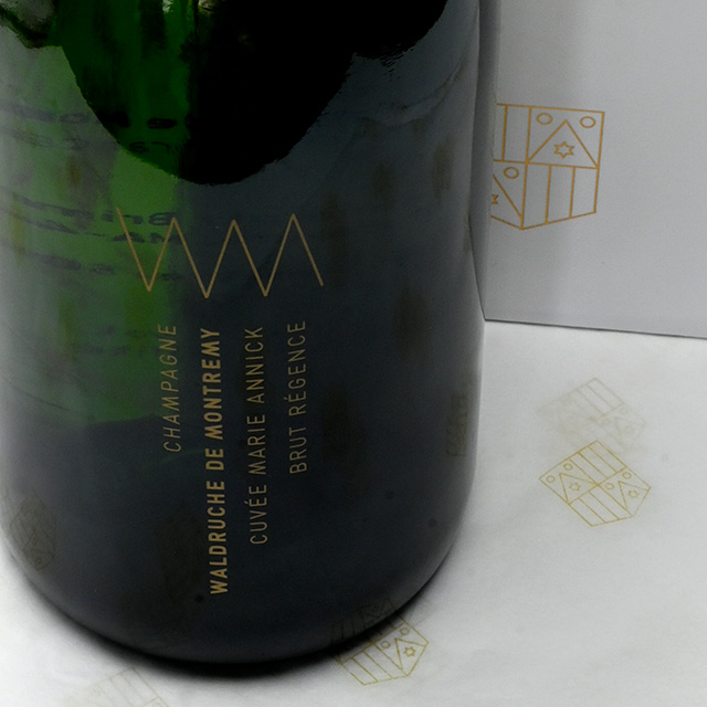
___ The new FL@33-designed champagne logo is often shown together with the redesigned family shield and both were therefore created in tandem. The boutique champagne's cuvée – identified by a selected name of the family – forms part of the logo and will be updated every year.
DESIGN | CROWNS AND ZIG AND ZAG
There comes the time in every designer's life when a zig-zag logo is one of the favourite solutions to be presented for client's initials or company names – abbreviations such as MMM, MVV and the likes – and this time zig-zag, with a touch of royalty and other associations, won the race.
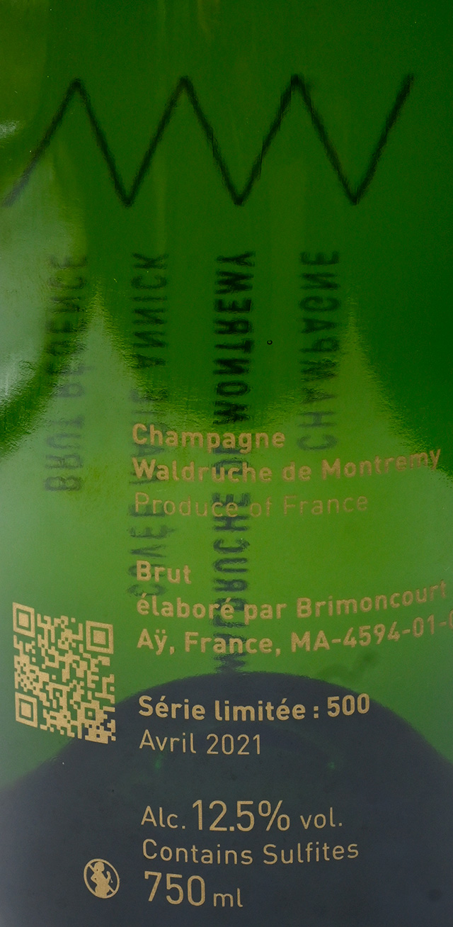
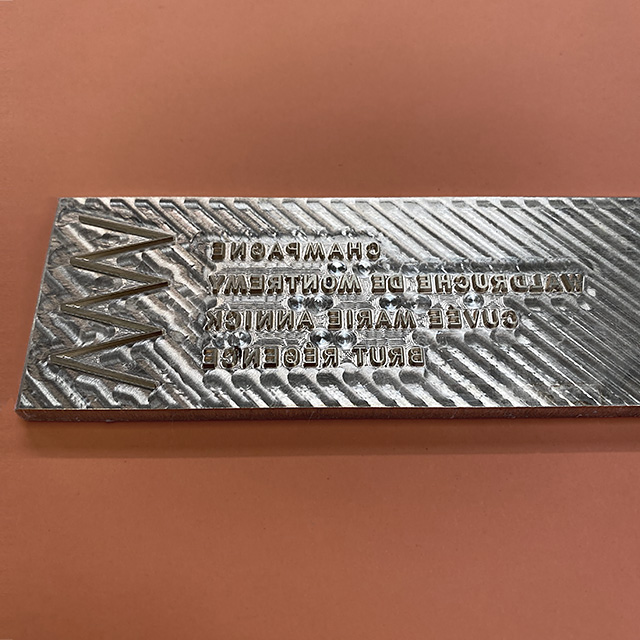
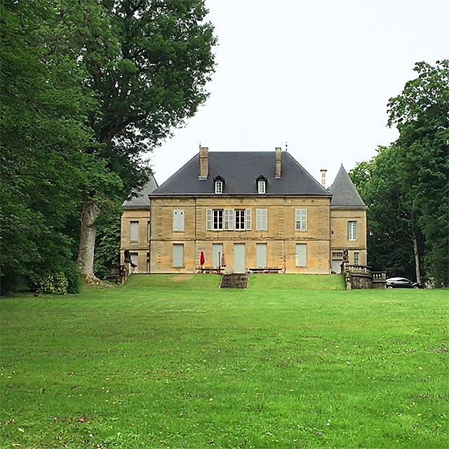
___ Waldruche de Montremy: WM or \/\/\/\ – resembling a little bit the silhouette of the Château Du Montremy with its two towers. The logo's shape is also like a crown and a bit like an exploding cork.
Champagne!
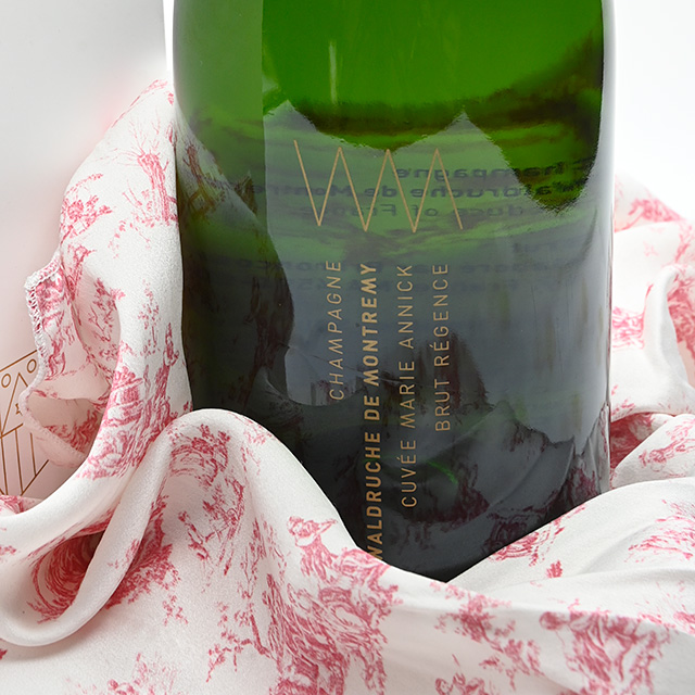
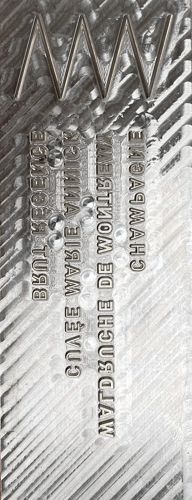
To be precise: Champagne Waldruche de Montremy, Cuvée Marie Annick, Brut Régence – the first of hopefully many cuvées to come. It was produced in a limited edition of 500 bottles – all featuring the new logo screenprinted in gold directly onto the glass.
THE YEAR THAT WAS NOT | PRESS
As with so many things around the world, this project too, was delayed by the pandemic. Design and production already started in 2018 but came to a grinding halt before the planned launch in 2020. It all finally came together at the end of 2021 and we now look forward to regular updates.
___ Related press is usually listed below on our website's project pages, but this time something rather unusual happened, so we break our own rule a little at this occasion...
___ The logo and the family shield were selected for inclusion into esteemed logo design books before the champagne was even launched. Namely the must-have publication Logo – The reference guide to symbols and logotypes (revised edition) and Modern Heraldry – Volume 2 with its subsequent review in Creative Review. Before the official launch of the champagne, this meant that we were not really allowed to mention the press or show the content on our website or social media channels. Very strange times indeed. Who would have thought in 2019 that the fairly slow wheels of book publishing would overtake us...
Categories: Campaigns, Customisation, FL@33 projects, Illustration, Logos | Identities, Print, Products, Typography
Sectors: Food | Beverage, Retail
