| maximalism -
the graphic design of decadence & excess
Pencils Posters
[General Q&A below]
1. What was the brief for these posters?
Who was the client? What do they do?
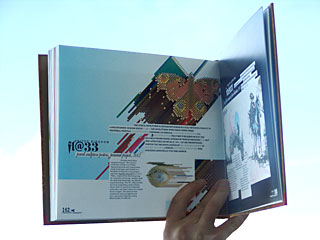
The self-initiated 'Pencil Sculpture Illustration Series' is a series
of altogether three artworks 'Eye Sculpture contains 470 Pencils',
'Butterfly Sculpture contains 818 Pencils' and finally the Creative
Review cover 11/2002 '40 years of D&AD'. 'Eye Sculpture contains
470 Pencils' has been created in early summer 2002 and has first been
published in July 2002 as self-promo spread in french A5-sized magazine
0FR (it's a zero at the beginning!) after being invited to contribute
to this issue by its art director.
'Eye Sculpture contains 470 Pencils' has later been presented as A2
poster during the 'GB: Graphic Britain' book launch exhibition at
Magma Gallery, London, in october 2002. 'Butterfly Sculpture contains
818 Pencils' - an A1 poster (pencils are original size at 100%, A1)
was especially designed for the same exhibition at magma gallery in
october 2002.
nathan gale - art director at creative review commissioned us to design
the creative review cover 11/2002 -the third and last in the series-
shortly after the exhibition opened.
2. How did you go about approaching
the design?
the first thing we did when we had the idea was to get out our nice
colour pencil collection of 200 or so faber aquarell pencils (the
box has been slightly dusty at the time...). we took photos, made
drawings and looked at a handful of them for a long time. the intriguing
isometric (45-degrees-based artificial perspective - usually used
for technical drawings) allows for very surprising visual effects
when used in carefully composed artworks. we discovered the 'Pencil
Sculpture Illustration Series' while experimenting.
the pencil - featuring reflective typography (3 stars and FL@33 or
4 stars and D&AD) is - we believe - one of THE icons for graphic
design/illustration and possibly nearly all creative fields and seemed
to be a good starting point.
3. What are the ideas behind the design?
What about the colour pattern? + 4. They are very bold and colourful
why did you take this appraoch to the design??
what intrigued us when we discovered the illustration technique for
us was the possibility to create multi-leveled imagery. close-up views
show surprisingly realistic pencils while the overall artwork reveals
rather photographic imagery due to the availability of the complete
colour spectrum when showing hundreds of colour pencils. due to the
mathematical isometric perspective huge spaces of pattern are generated
when duplicating huge amounts of pencils.
5. How was the imagery created? / Where
did it come from?
the pencils are created as vector graphics and have been generated
digitally using macromedia freehand.
6. What inspired them?
pixel illustrations which are usually based on 90/45 degrees angles.
7. Finally, is there anything else
interesting about the project that I should know and include in the
accompanying text?
in all cases the pencil illustration is original-sized.
'Eye Sculpture contains 470 Pencils' (pencils are original size at
100%, A2), 'Butterfly Sculpture contains 818 Pencils' (pencils are
original size at 100%, A1)
General Q&A
1. Do you think that graphic design
has lately seen a return of sorts to a more decorative/maximalist
approach to design in the sense that after years of minimalist rule,
ornament is no longer a crime. Architecture is more curvaceous, fashion
more glamorous, design more decorative. Silhouette and botanical motifs
are taking over from rigorous, simple lines and muted tones. A profusion
of colour and luxury, brimming with excess, is stating the case for
a return to sensuality?
your definition of maximalist seems a bit irritating as some decorative
piece might even be minimalist in it's concept and/or overall feel
to it. but we know what you mean...
so - yes - it's a fashionable thing to do at the moment. it's one
of the logical results of the designer-as-author discussion of the
last 5 - 10 years. a lot of designers became more artistic and personal.
the hand-made movement did the rest. books such as 'romantik' by gestalten
verlag and this book will probably make the maximalist/romantic movement
redundant within a relatively short period of time. ((( it's probably
gonna be yet another overkill and designers/illustrators and artists
will move on before the 'style' or 'movement' has been sufficiently
explored to last. ))) but emotional and more personal graphic design
will hopefully be with us for a long time to come.
2. If yes, why do you think that is?
it's probably a bit of what we said before and the global economic
recession - sorry stagnation - of the last couple of years which saw
the increase in luxury sales while at the same time thousands of companies
went bust - as usual in times like this. in fact much of the graphic
design around has a bit of the 20ies orgies-and-decadent-indulgence-in-luxury
and melancholic hey-there-might-not-be-a-tomorrow-anyway-feel to it...
3. If no, is it just that there has
always been decorative/maximalist/in your face design but that the
minimalist ‘Helvetica ranged left’ look too over for a
while there?
it's always been around. as nearly everything else styles and fashions
come and go in waves.
4. What do you like about more maximalist
/ decadent / colour saturated design?
it often allows projects to have a more emotional and warm feel to
it. we often use mixed-media techniques incorporating hand-made illustrations
in the overall composition to increase this side-effect (not represented
though in the selected work)
5. What do you NOT like about more
maximalist / decadent / colour saturated design?
we appreciate graphic art which is not necessarily defined by the
modernist criteria of 'problem solving' and 'visual communication'
but a stand-alone piece - but used in the wrong context as pseudo-communication
- it often appears to be rather superficial. in terms of style similar
to some photoshop illustrations in the early nineties when every filter
plugin available was used in some cases and moderation seemed to be
a state-of-mind of the past.
6. What is your favourite piece of
maximalist design and why?
it's got to be 'wasserschlangen I' by gustav klimt (we checked: it's
from 1904-07), besides 70ies graphic designer wojtek siudmaks, some
of vaughan olivers' work for 4AD label and the piece referred to so
many times to describe the current 'romantic' movement in graphic
art/design: bjorks' vespertine cover from 2001 by M/M.
7. How do you think designers can evoke
a sense of fantasy, luxury or sensuality within a graphic design piece
without huge budgets?
we strongly believe that imagination, clever usage of materials and
production techniques, experimentation and making it obvious that
there is a certain amount of love in the creations are not a matter
of budget
8. What made you submit the work you
did for this book, what do you think is ‘maximalist’ about
it?
we have produced quite a range of even more decorative/ornamental
projects but the ones you picked have one thing in common: they are
minimalist with a maximalist twist and hopefully show all the criteria
mentioned in the answers for question 7.
|